DESIGN PROBLEM
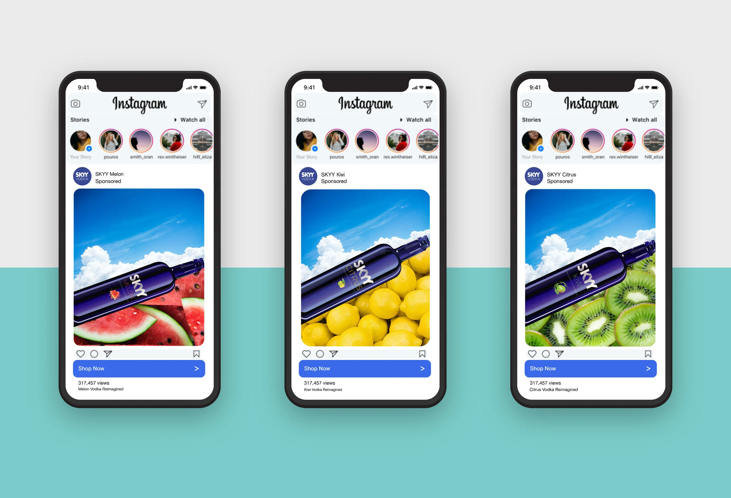
SKYY Vodka was established in San Francisco and has been a powerful brand in the world of vodka. Selling a fun and sexy lifestyle, SKYY uses bright colors, a unique bottle and not much else to make an impact on consumers.
In order to highlight the new Kiwi and Melon flavors and revitalize SKYY Citrus, we get a taste of the new campaign. At the core of SKYY is the bottle. Therefore, we need a vector based illustration that can be scaled to size of a billboard and shrunk to the size of the smart watch. Below, is how that bottle was made.
DESIGN PROCESS
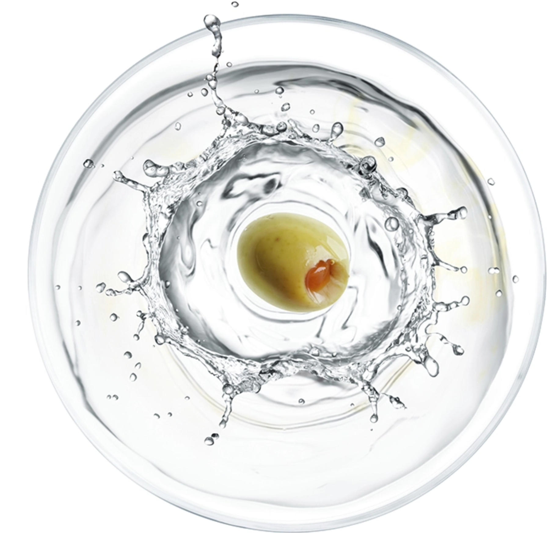
In a departure from the brand’s matte colors, the new campaign attempts to bring SKYY into the real world. Using powerful and simple imagery, the consumer gets a strong sense of color and the iconic bottle brings the viewer in for each of the three new flavors. Moving away from the hyper sexualized campaigns of the past, this campaign attempts stay focused on what really matters, vodka and what is in it. In our busy lives, this campaign attempts to create a simple, calming and refreshing moment.